

Most companies choose a category and spend a brand’s lifetime defending it. Navisuna Partners was built to do the opposite. A Singapore-registered partnership house with founders spanning strategy, operations and global business development, it set out to move across five capabilities, five technologies and five industries at once, from quantum computing to agriculture, from defence to finance, treating each not as a distraction from focus but as evidence of it.
Before Enki was brought in, Navisuna had no public face at all. No website, no LinkedIn presence, no visual identity, nothing a prospective partner or investor could look up before a first call.
The brief wasn't to make Navisuna look
impressive.
It was to make five unrelated industries
look like they belonged to the same sentence.
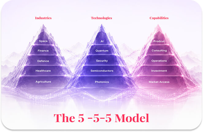
Most brand briefs arrive with a category already decided. Navisuna’s arrived with a framework instead: a 5-5-5 model spanning Consulting, Operations, Product, Market Access and Investment as capabilities; AI, Quantum and HPC, Holistic Security, Semiconductors and Photonic Infrastructure as technologies; Healthcare, Agriculture, Defence, Space and Finance as industries.
On paper, that reads like five different companies wearing one name. The founding team’s own conviction, built around a model they called SOAR, Aspirations, Analyze and Leverage, Seize and Align, Results and Win, was that the method was the brand, not the sector. Navisuna wasn’t betting on any single industry’s future. It was betting on its own ability to move fluently between all of them.
That left Enki with an unusual first task: build an identity that could hold quantum computing and rice paddies in the same visual language, without either one feeling like it was borrowed from a stock template.
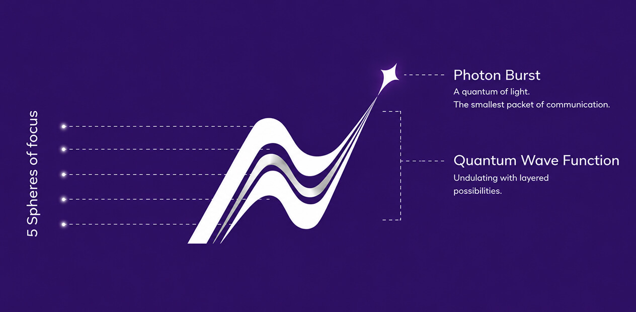
A portfolio this wide can’t be branded around what Navisuna does, because what it does changes by client and by continent. So the identity had to be built around how Navisuna behaves instead: as a long-term, strategic, operating partner, not a vendor passing through.
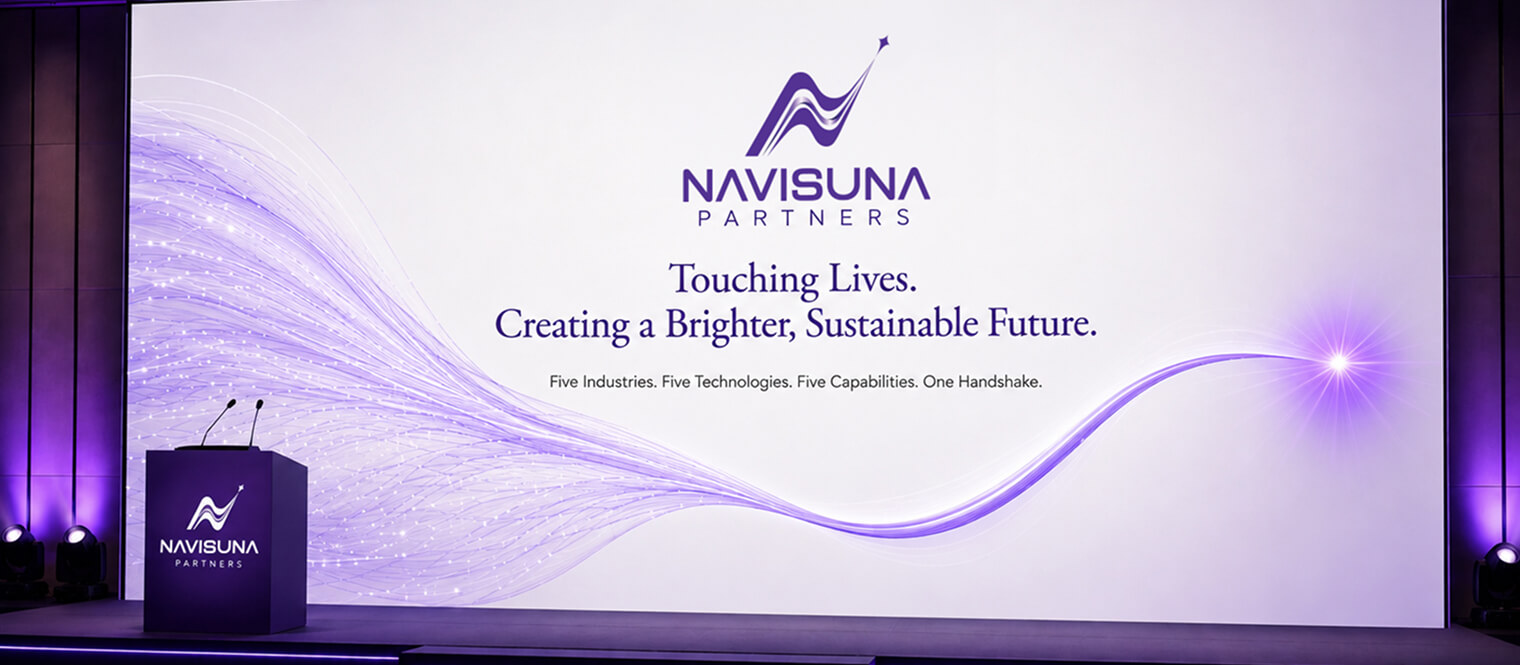
The line that carried this through every surface was simple and deliberately human: Touching Lives. Creating a Brighter, Sustainable Future.
Not a claim about technology. A claim about intent. Every subsequent decision, tone, colour, imagery, was tested against whether it still felt like a partner’s handshake rather than a consultancy’s pitch deck.

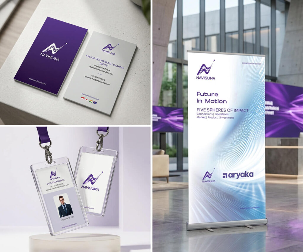
The identity system needed enough restraint to stay credible next to a semiconductor roadmap, and enough warmth to stay credible next to a farmer holding soil that breathes. That tension shaped everything from the logo system to the corporate deck template, business cards, letterheads and branding guidelines, all built to flex across industries without ever feeling generic.
Rather than illustrating five industries literally, the visual language leaned on a founding metaphor the team returned to often: interconnected systems, aspirations, alignment, results, quietly present in layout, colour transitions and iconography, so the SOAR model lived in the design itself, not just in the pitch.
Abstractions don’t convert. So the first real test of the identity wasn’t a slide deck, it was a story with soil under its fingernails. Navisuna’s Precision Natural Farming initiative became the proof point: drones scanning fields, biochar replacing chemical fertiliser, a partner trust platform making every step from seed to shelf traceable, deployed across India, Southeast Asia, Japan and Australia.
The script written for its film treated regeneration as the throughline. Stubble burning addressed in Indian rice belts. Degraded soils rebuilt for Malaysian palm oil cooperatives navigating EU deforestation regulation. Precision tools supporting Japan’s ageing farmer population. One brand voice, three entirely different agricultural realities.
It was the clearest proof the identity could hold what it was designed to hold: specificity inside every market, coherence across all of them.
On World Environment Day 2025, Navisuna took its first public steps into digital visibility, a brand identity, a single-page website, and a voice that could speak to a quantum engineer and a rice farmer without sounding like two different companies. What began as a five-by-five-by-five framework on paper became a brand people could actually meet.