When Did Snack Time Forget How to Have Fun?

Somewhere between convenience and habit, snacking became efficient. Hands reached into packs, crunch followed, flavours delivered their promise, and the moment moved on. Crunchy Rings arrived as a gentle reminder that food does not have to behave so seriously. Its very shape carried mischief. A ring that slipped onto fingers before it ever reached the mouth. A snack that already knew how to play.

Enki Studio’s response was to amplify that playfulness without touching the core design of the pack. The solution lived in interpretation, not redesign. The ring became a performer, the finger became a partner, and the pack became an invitation to join the Finger Dance.

A Shape Waiting to Be

Understood.

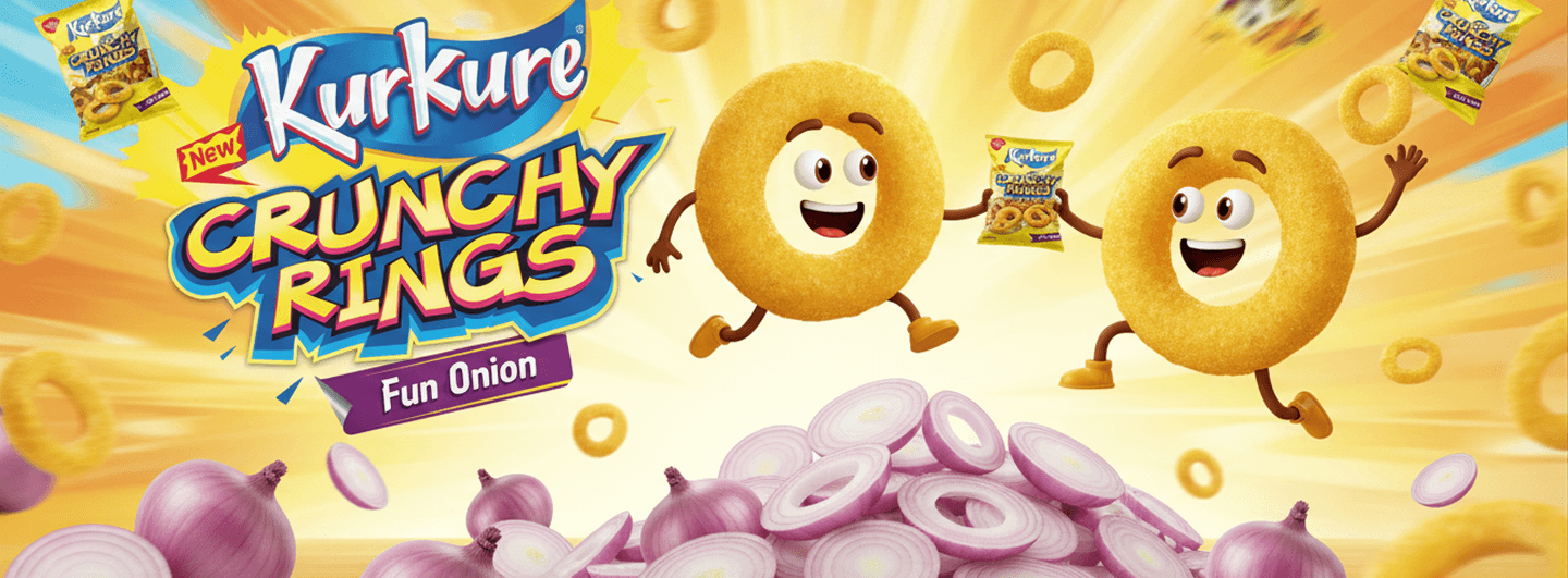
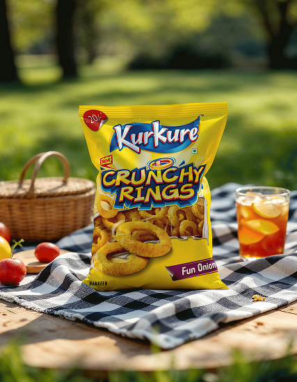
Kurkure has always thrived on boldness, spice, and personality. Crunchy Rings carried that energy in its form long before it asked for visual reinvention. The brief was clear and deceptively restrictive. Add fun to the pack without changing it.

Rather than look for embellishment, Enki chose to look closer. Rings are circles. Circles suggest motion. Motion suggests rhythm. And rhythm inevitably leads to dance. What was hiding in plain sight was not a graphic opportunity, but a behavioural one.

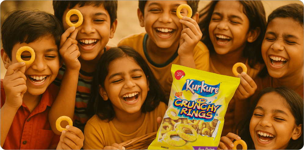
The snack already sat on fingers. All it needed was a reason to move.

The Finger Dance Insight

Every great design idea feels obvious in hindsight. The Finger Dance was one of those ideas.

Enki reimagined the ring not as a snack shape but as a hoola hoop in miniature. A symbol of play, rotation, and joy. The typography stepped in as an accomplice. The letter N extended into a finger, turning language into gesture and packaging into participation.

The pack no longer spoke only to the eye. It spoke to the hand. It nudged consumers toward interaction without instruction. No arrows. No explanations. Just a visual cue that said, go on, play with your food.

Designing Behaviour

The brilliance of the intervention lay in its restraint. The Kurkure Crunchy Rings pack remained unmistakably itself. Brand colours held their ground. The identity stayed intact. The addition felt native, as though it had always belonged there.

By introducing a gesture rather than an illustration, the design invited action. Fingers slipped into rings. Rings flicked. Hands moved. Snack time turned kinetic.

This was design that did not sit quietly on a shelf. It suggested behaviour. It triggered smiles. It created moments.

Fun That Knows When to Stop

Playfulness, when handled without intelligence, can slide into noise. Enki’s approach was to keep the fun sharp and the execution disciplined.

The Finger Dance lived lightly on the pack. It did not shout. It winked. Collaterals and point of sale materials carried the same energy, extending the idea into the retail environment without overwhelming it. The snack stayed credible. The humour stayed clever.

Crunch remained the hero. The dance simply made it memorable.

Enki’s Way of

Seeing the Brief

For Enki Studio, this project reaffirmed a core belief. Great design does not always arrive by adding more. Sometimes it arrives by noticing what people are already doing and giving it meaning.

By treating the snack as a cultural object rather than a consumable product, Enki turned packaging into an invitation. The Finger Dance was not imposed. It was revealed.

When design listens carefully enough, behaviour speaks first.

Outcome

Kurkure Crunchy Rings emerged with renewed energy on shelf and in hand. The pack invited interaction, sparked conversation, and reminded consumers that snacking can still be playful. Without changing its design, the product gained a new dimension of engagement.

It proved a simple truth.
 Fun never left snack time.
 It was only waiting to be noticed.

And sometimes, all it takes is a ring and a finger to bring it back.