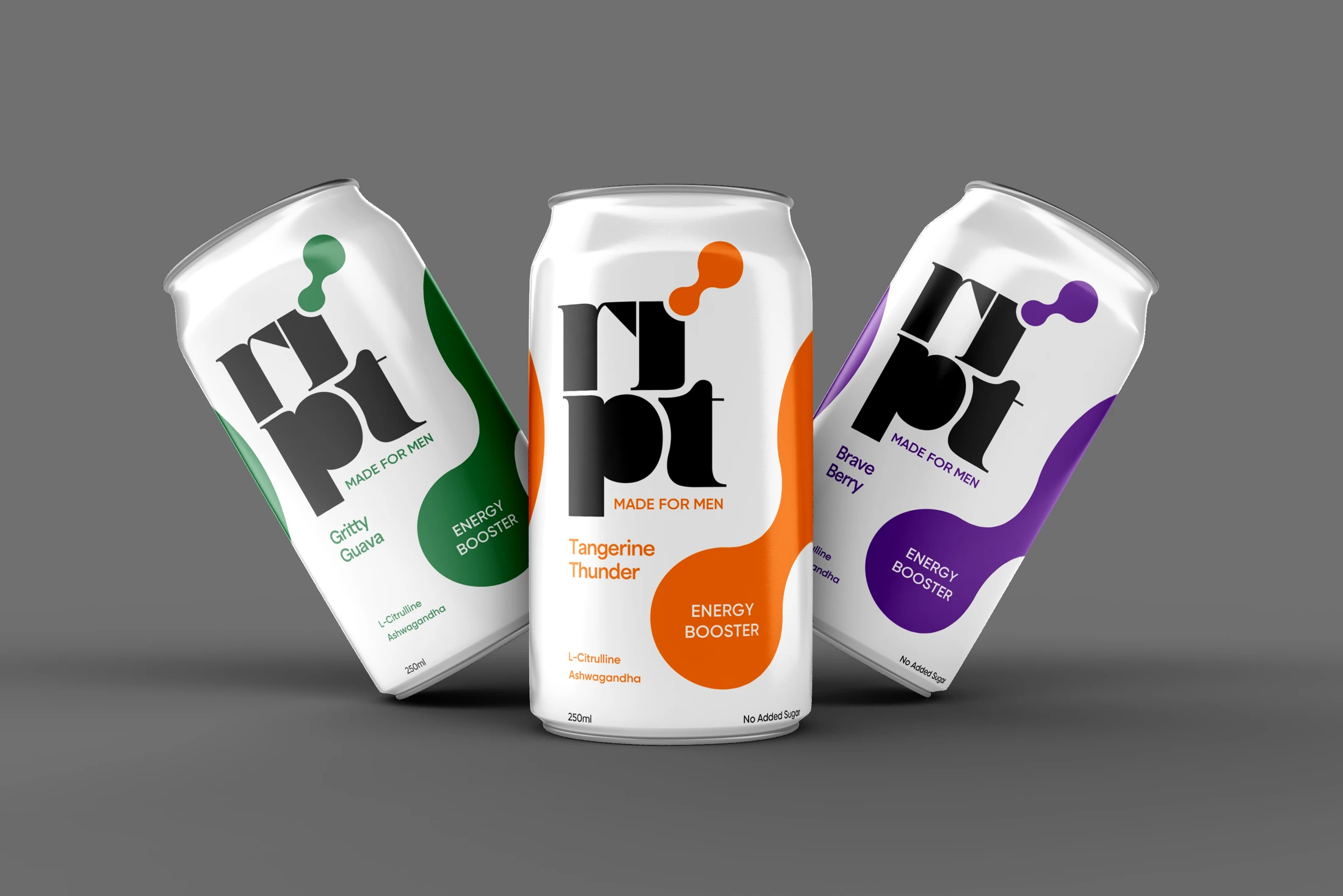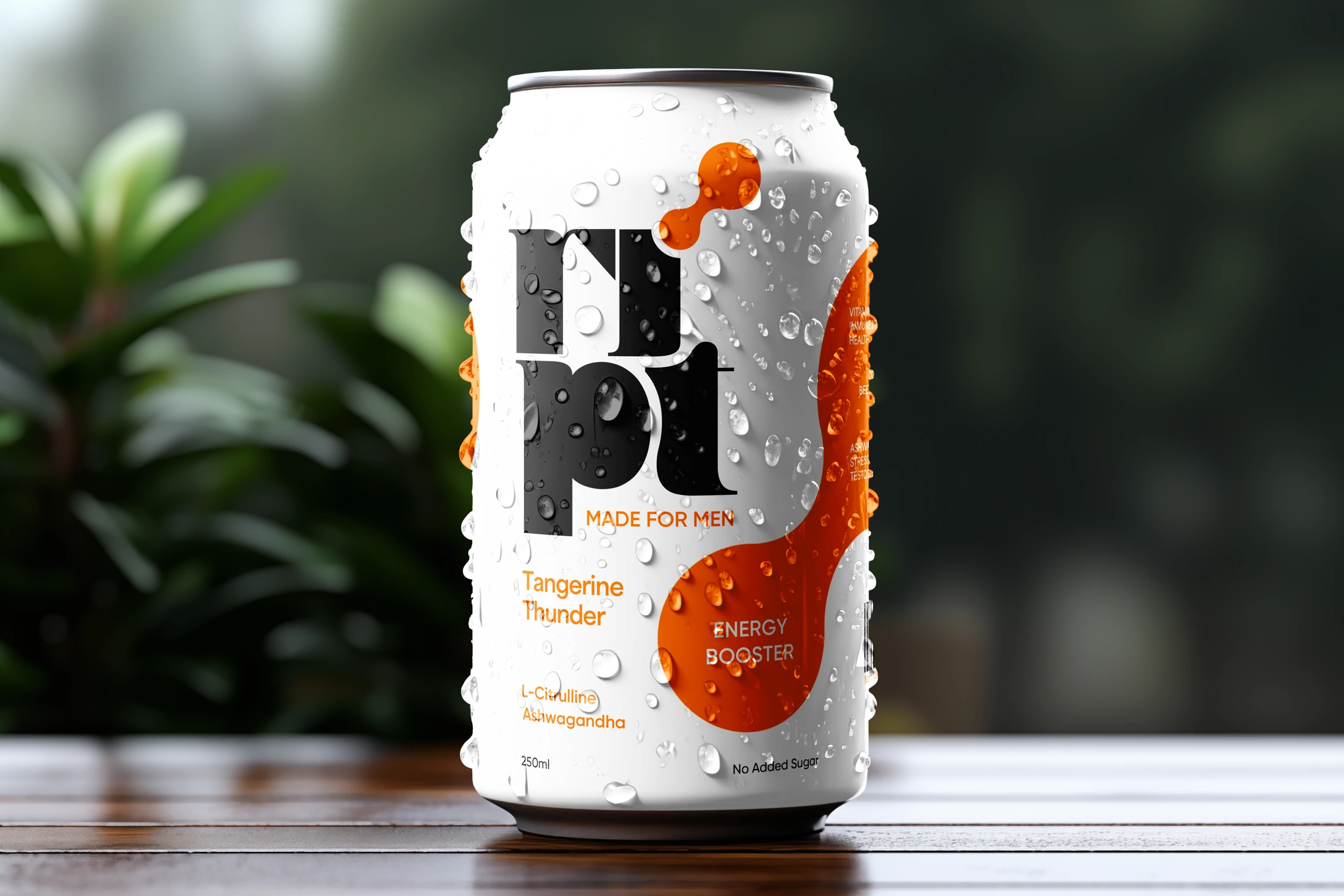
The energy drink aisle is a loud place. Every can on it is shouting, and most of them are shouting the same three words: lightning, flame, wings.
RIPT arrived with a different ambition. It was built for men, and built to be good for them. L-Citrulline for the heart and for recovery. Ashwagandha for stress and stamina. Cordyceps and beetroot for endurance. No artificial sweeteners, no dyes, and no crash waiting at the bottom of the can.
The formula was serious. The question Enki Studio was handed in November 2024 was whether a brand could be serious too, and still hold its own on a shelf full of shouting.
The brief asked for the expected things. Masculine, bold, clean, premium. Type with a spine. A can that looks like it belongs in a kit bag next to a skipping rope and a pair of wraps, closer to tactical gear than to a party.
Then came the rule that shaped everything else. No lightning bolts. No flames.
Banning the lightning bolt from an energy drink is a little like banning the apple from a painting of Eden. It removes the cliché, and it leaves the painter to work out what the story was really about. Strength had to be shown with geometry instead: structured patterns, firm lines, a sense of forward motion that never needed to catch fire.
The label had a job as well. The front had to sell in a glance: the RIPT name, the line Fuel Your Power, and three promises. Instant energy. Support for men's health. A smooth curve instead of a spike. The back had to explain, without sounding like a pharmacy leaflet, why ashwagandha and beetroot were sitting inside a can.

Most energy drinks sell the spike. A jolt, a rush, a story that ends an hour later with a man staring at a spreadsheet he no longer understands.
The men RIPT was made for don't need a spike. They run long days, then train, then get up and do it again. They are competing to stay ahead of the curve, and what they need is for the climb to last.
Energy was never the problem. Endurance was.
That gave RIPT its posture. It would not promise wings. It would promise that you'd still be standing at the end of the day.
It also settled a quieter question: how to say made for men without putting a man on the can. Early in the work, the direction was to suggest him rather than show him. A speech bubble. A beard. A moustache, with a wink at No Shave November. Men recognise themselves faster in a detail than in a stock-photo torso, and they trust it more.
The first routes were competent, which is the most dangerous thing a first route can be. They looked like energy drinks. That was the problem.
So the team went back in. One route pushed colour and attitude. Another stripped everything back and let white space do the lifting. Each round was held against the same question: would a man pick this up because it looked strong, or because it looked like everything else?
The route that won kept the boldness and dropped the noise. RIPT sits big and unapologetic. Fuel Your Power sits beneath it, plain enough to be believed.
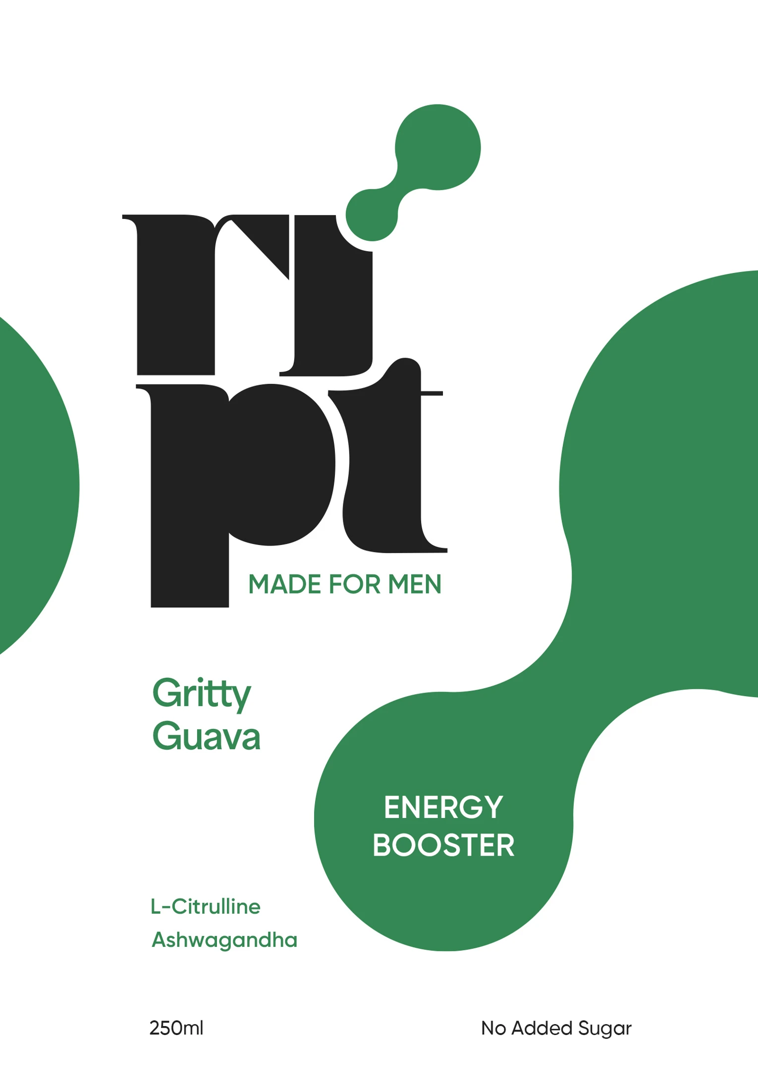
The label works in two speeds.
The front is for the three seconds a can gets on a shelf. Name, line, three benefits, done.
The back is for the man who turns it over to check what he's drinking. Every key ingredient earns an icon so the benefit reads before the word does: a heart for cardiovascular health, a dumbbell for recovery. Three callouts close the case. No artificial sweeteners or dyes. Natural sweeteners only. No crash.
The brief banned the lightning bolt. The first flavour, Tangerine Thunder, kept the weather in the name, which is exactly where it belongs.
The category had already decided what an energy drink should look like. Enki's job was to disagree with it politely and design the disagreement.
That meant reading the formula before drawing the can. It meant letting one rule, no lightning, force better ideas than a blank page ever would. And it meant throwing out work that was good enough, twice, until it was right.
Not louder. Longer lasting.
RIPT left the studio as a complete brand: a name with a line, an identity, a two-speed label system, can mockups, and a launch film that went live on International Men's Day.
It stands on the shelf the way its drinker wants to stand at the end of a long day. Upright, unhurried, and still in the game.
Some things in life don't come twice. A first impression is one of them.