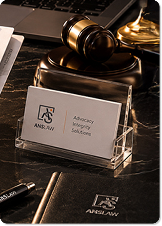
Law is not a service.
It is a stance.

When two of Delhi’s sharpest legal minds decided they were done playing by the old firm’s rulebook, they needed a brand that could keep up.
Enki Studio built one from scratch.

Identity, voice, and a digital home that felt nothing like a law firm, and everything like one.

The Brief

A firm that refuses to be boring about law.

Aditya Singh and Sumant Narang had built their practice across courtrooms most lawyers hesitate to enter-APTEL, NCDRC, NCLT, criminal courts, corporate boardrooms. Their combined range covered 
Constitutional law, Criminal Defense, Corporate matters, Intellectual 
Property, and Financial Settlements.

What they lacked was not credibility. They had that in abundance. What they needed was a brand that could represent who they actually were: precise, confident, and refreshingly human in a profession that rarely allows for any of the above.
The brief, stripped to its core: create an identity and website for a New Delhi law firm that commands authority without demanding deference. Make it approachable without making it soft.

A mark that holds its ground

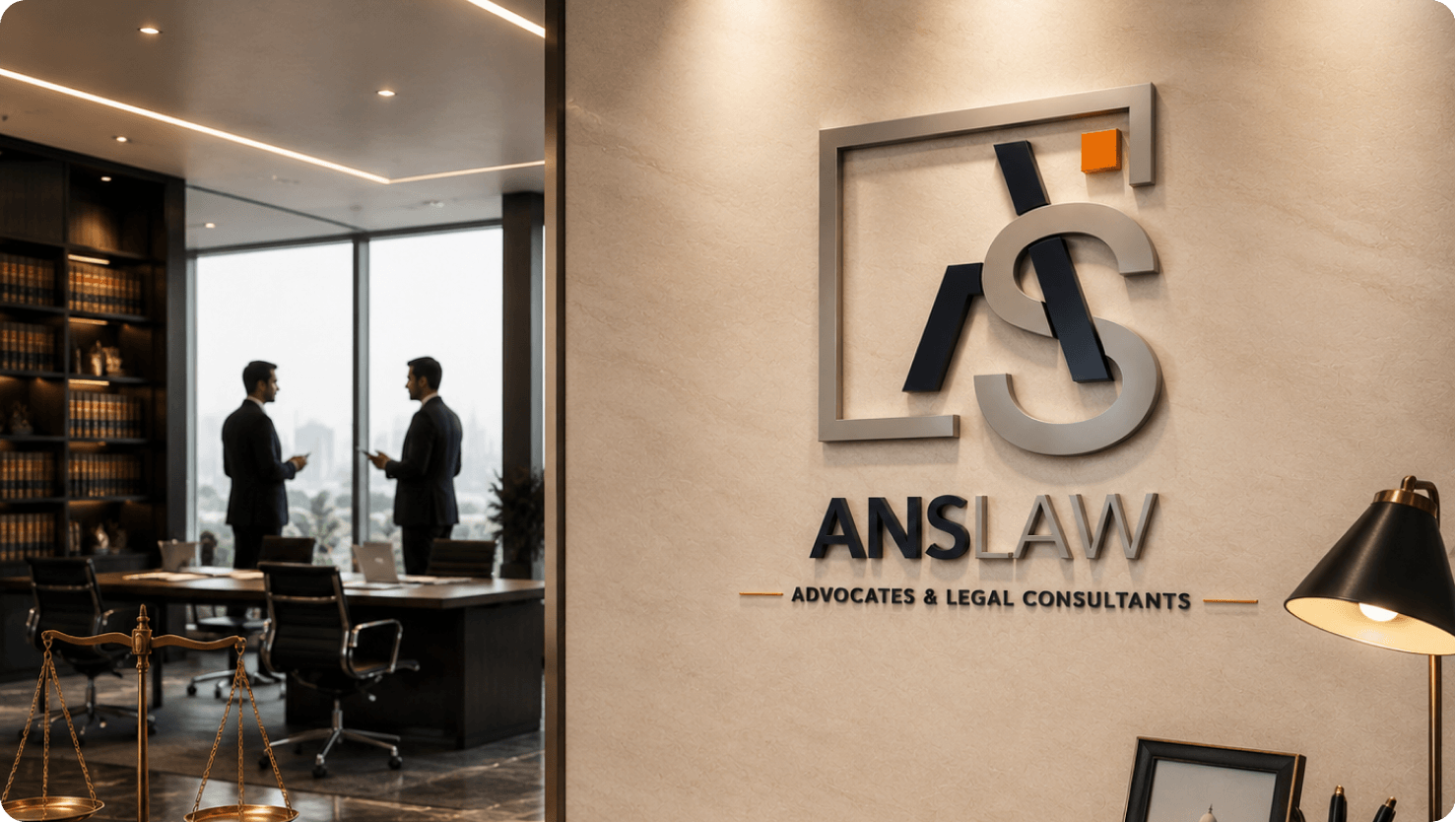
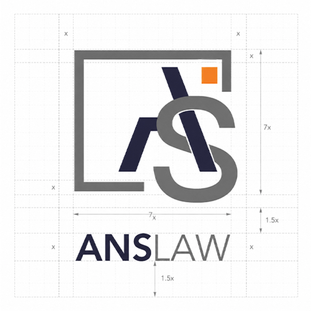
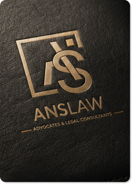
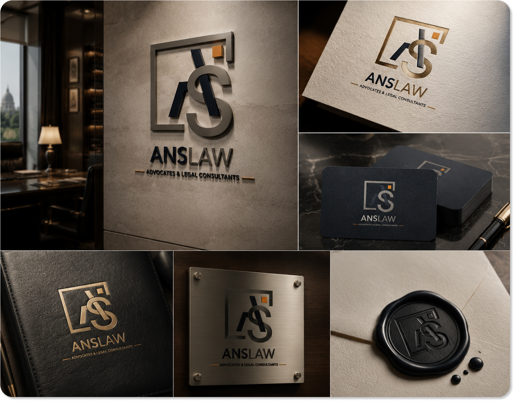
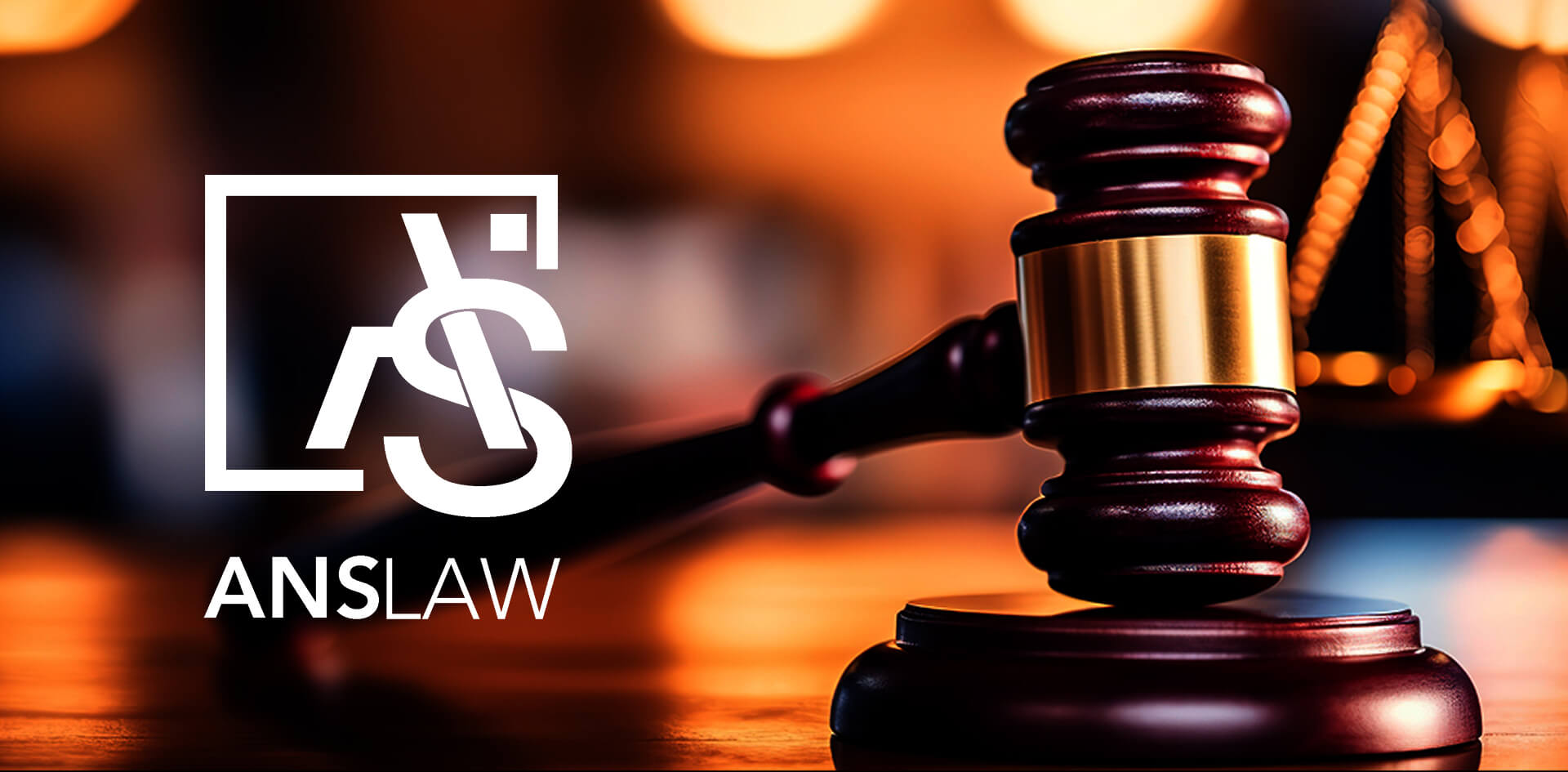
The ANS logomark was built around the idea of precision-each letterform occupying its space with intent. No flourishes, no symbolism borrowed from scales or gavels. The brand doesn’t need to announce that it is a law firm. It only needs to announce that it means business.

The typographic system pairs a refined serif for editorial moments-headlines, section titles, the voice of the firm-with a clean geometric sans for functional communication. The combination gives the brand range: it can be solemn when required, and surprisingly light when that serves the moment better.
The colour palette was kept deliberately restrained. Deep charcoal anchors all materials with authority. A warm orange through it as signal: this firm values its reputation, its time, and its clients.

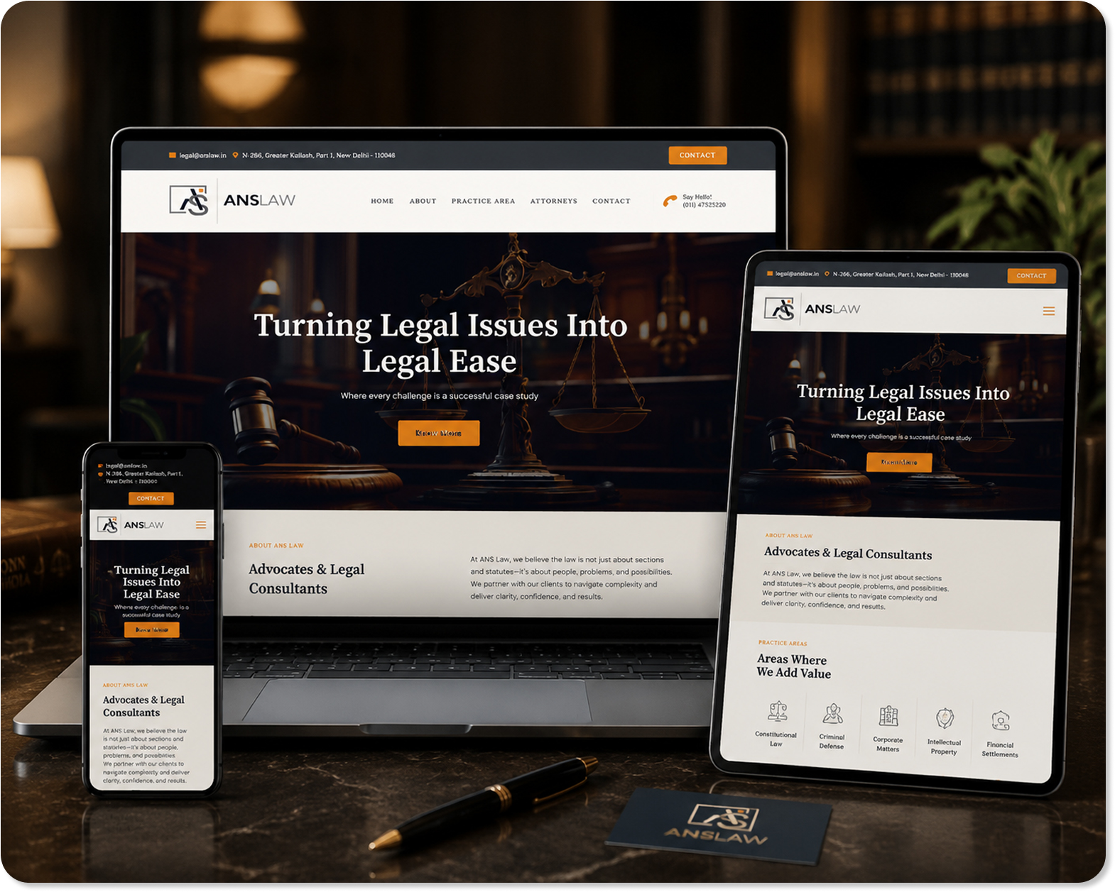
The ANS Law website was architected around a single question: what does a potential client need to feel, in the first thirty seconds, to pick up the phone? The answer was not impressed-it was reassured. Confident. In safe hands.

The navigation was kept spare. Five pages. Each one pulling its weight. 
Home establishes the personality. About contextualises the firm’s approach. Practice Area lays out the range. Attorneys humanise the expertise. 
Contact removes every possible friction from reaching out.

On mobile-where most clients in crisis first search for legal help-the site was optimised to load fast, read clearly, and make the phone number impossible to miss. Because at 11 PM on a difficult evening, the website’s job is not to be beautiful. It is to be a bridge.